(302) 262 8484
Why the Save Icon Still Looks Like a Floppy Disk

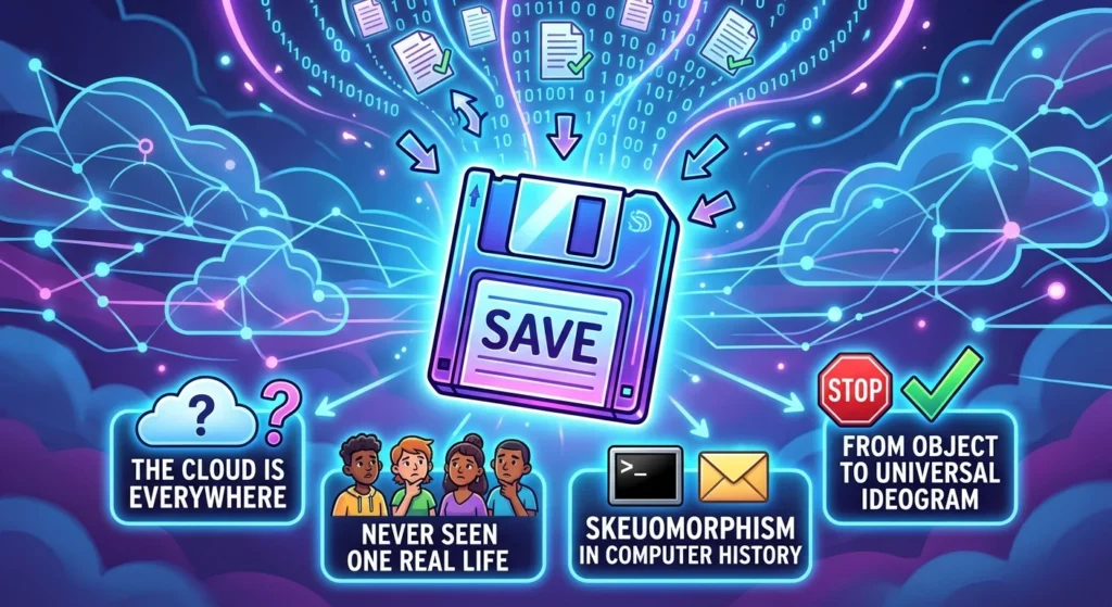
The save icon still looks like a floppy disk, even though most computer users under thirty have never seen one in real life. It remains one of the most stubborn visual relics in technology. Despite the dominance of cloud storage and instant syncing, that tiny square from the 1980s is still the universal signpost for preserving your digital work, though understanding the dangerous illusion of cloud storage is vital for data safety.
The Origins of the Floppy Disk Save Icon
To understand why this outdated hardware still sits at the top of your screen, you have to look back at early personal computing. Before graphical user interfaces became common in the 1980s, operating a computer required typing text commands. Doing anything meant memorizing precise code syntax, which made systems intimidating for everyday people.
Designers solved this problem using skeuomorphism—the practice of making digital tools look and behave like physical objects. An envelope represented email, a metal trash bin meant delete, and a 3.5-inch floppy disk represented saving your work.
When Microsoft standardized toolbars across programs like Word and Excel in the early 1990s, the floppy disk was locked into the visual vocabulary of software. Back then, saving was a literal action. You clicked the button, and the computer wrote data directly onto a physical disk in your drive slot, a process that often required reliable IT infrastructure for small businesses to manage their files effectively.
From Physical Object to Universal Symbol
Technology evolved, but the visual language stayed put. As zip drives, flash drives, and cloud storage pushed physical floppy disks into extinction, designers faced a unique problem. The object was dead, but the icon was more recognizable than ever, much like how PC upgrades in Delaware can breathe new life into aging hardware.
Over time, the save icon underwent a conceptual shift. It stopped being a resemblance icon, which mimics a physical tool, and transformed into an abstract ideogram. Much like how a red octagon means stop without needing the word written on it, the square plastic disk became shorthand for the concept of saving.
A well-known joke in tech circles describes a younger user seeing a real 3.5-inch disk for the first time and assuming someone 3D-printed the save button. That reaction shows how completely the icon outgrew the hardware that created it.
Everyday Icons from Obsolete Tech
The save button is not the only piece of outdated hardware living inside our screens. Modern software relies on several visual references to obsolete technology, which is why professional IT consulting is so important for businesses navigating legacy systems.
- Telephone Handset: The rounded, curved phone handle used for call buttons on modern smartphones was originally modeled after old landline receivers.
- Envelope: Digital messaging almost universally uses a folded paper letter to represent email, an action that rarely involves physical paper.
- Radio Buttons: The circular selection buttons on web forms get their name and function from classic mechanical car radios, where pressing one button popped the others out.
- Clipboard: The icon used for pasting text references a wooden board with a metal latch that most office workers haven’t used in decades.
Why UX Designers Struggle to Replace It
You might wonder why designers do not just update the graphic to something relevant like a cloud or a hard drive. They have tried, but every alternative creates instant confusion.
A cloud icon usually signals syncing or downloading rather than making a permanent local copy. Downward arrows look like download buttons. Piggy banks feel like financial tools, and padlocks imply security settings. None of these graphics communicate the intent to save a file as clearly as the 3.5-inch floppy disk.
Replacing a universally understood symbol introduces friction. If users have to stop and think about what a button does, the interface design has failed. For more on how software interfaces balance familiarity with modern needs, see our guide on [digital interface design principles].
The Future of the Save Icon
As cloud-native apps like Google Docs and web editors embrace automatic background saving, the manual save button is starting to fade. In many modern tools, saving happens continuously without you ever touching a menu.
However, in professional desktop applications like image editors, CAD software, and video production tools, explicit manual saving remains essential. Until someone invents a clearer visual shortcut for preserving digital files, the floppy disk icon will hold its spot at the top of your toolbar.