(302) 262 8484
Why Your Website Needs a Facelift
You look at your site and something just feels off. It works fine. The links go to the right places. But it lacks that polished edge your competitors seem to have.
Figuring out how to make your website look more professional in one afternoon might sound like a stretch. It really is not. You don’t need to hire an expensive agency or learn how to code. You just need to fix the tiny details that are quietly ruining your credibility.
People judge your business within milliseconds of landing on your homepage. If your site looks like it was built a decade ago, visitors will assume your methods are outdated too. A sloppy design screams amateur. We want to avoid that entirely.
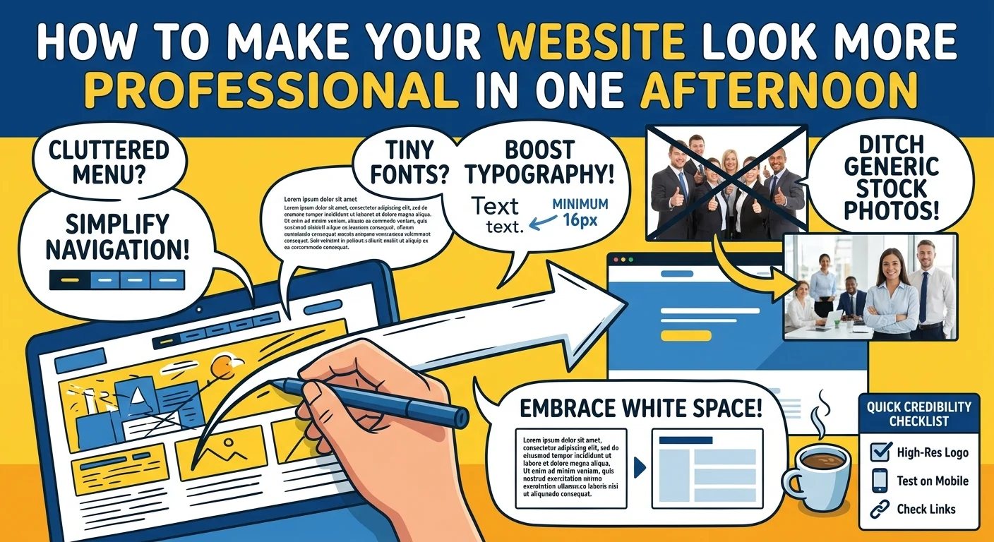
How to Make Your Website Look More Professional in One Afternoon
Let’s get straight to the work. Grab a cup of coffee and block out a few hours. Here is exactly what you need to tackle to completely change how people perceive your business online.
Simplify Your Navigation Menu
The biggest mistake I see on small business websites is a cluttered header. Your visitors do not need a link to every single page on your site from the top menu. It is overwhelming.
Limit your main navigation to five or six essential links. Put the rest in the footer. If you have massive dropdown menus, kill them, or consider professional website solutions to restructure your navigation for better usability. They are annoying to use on mobile and usually just confuse people trying to find basic information.
Fix Your Typography and Font Sizes
Tiny text is a conversion killer. If people have to squint to read your blog posts, they will just leave.
Bump your body text up to at least 16px. Many modern sites are pushing 18px or even 20px for better readability. While you are at it, check your font pairings. Stick to two fonts maximum. Use one clean sans-serif for your headings and a highly readable font for your body copy.
Never use Comic Sans or Papyrus. Just don’t do it.
Delete the Awful Stock Photos
You know the exact photos I am talking about. The perfectly diverse group of executives pointing at a floating chart. The customer service rep with a blindingly white smile and a headset.
These images destroy trust. They tell your visitor that you are hiding behind generic corporate filler.
Replace them today. Use real photos of your team or your workspace. If you absolutely must use stock photography, spend twenty minutes on sites like Unsplash or Pexels to find authentic and candid shots that actually look like real life.
Add Massive Amounts of White Space
Amateurs try to fill every pixel of the screen. Professionals let things breathe.
White space is just the empty space between your text, images, and buttons. It acts like visual glue holding your layout together while giving the eyes a rest, which is a key principle we apply during ongoing website maintenance and support in Delaware. Go into your page builder and double the padding between your major sections.
It feels scary at first. Do it anyway.
You will be shocked at how much more expensive your site looks immediately.
The Quick Website Credibility Checklist
Want a fast rundown for your afternoon sprint? Here is a checklist to keep you on track, and if you need further help, our team provides SEO and SEM in Delaware to ensure your site performs as well as it looks. and optimize for a better user experience.
- Check all your links to make sure nothing is broken.
- Update your logo so it is high resolution and has a transparent background.
- Verify your contact info so your phone number and email are incredibly easy to find.
- Audit your homepage copy and delete any useless industry jargon.
- Test your site on your phone to ensure nothing overlaps weirdly or breaks off the screen.
A Quick Note on Color Schemes
Too many colors will make your website look like a circus. Pick one primary brand color. Use it for your buttons and important links. Then rely on plenty of white, light gray, and dark charcoal for everything else.
Here is a pro tip. Stark black text on a stark white background can actually cause eye strain. Soften your text color to a very dark gray. It is a tiny tweak that makes a massive psychological difference. For more details on this, check out our guide on [choosing brand colors].
Ready for a Better Website?
You don’t need a massive budget to build trust online. You just need to care about the details.
By taking a few hours to clean up your navigation, fix your fonts, and embrace white space, you can completely transform your digital storefront. Roll up your sleeves and get to work. Your future customers will thank you.